Wednesday, July 17, 2013

Pretty Girl Modern Girl Collage


Here's my latest Modern Girl.

I've really enjoying making tweens lately. I think it's a great bit of childhood to represent because it's not too babyish nor is it too womanly. 

My favorite part of this one is how she's standing in a rainbow. It gives the impression that this angelic girl really can reach for her dreams no matter how big. 


And this message, I wish we could all internalize it... young. 

It would save so much heart ache.


Thursday, July 11, 2013

Punk Fairy Girl Original Collage

So I had to make another fairy girl using the lovely Jill stamp from Stampotique. 

Couldn't help myself :-)

There was some serious Gelli Plate madness going on with this fairy girl. Every part of her, save for the book paper is mono-prints I made by hand using my Gelli Plate. Oh my gosh, how I love that thing!


Did you know Julie Balzers's Blazonry stencil for TCW is PERFECT for making wings. Seriously. Perfect. 


And I used the little skull stamp from Bombshell Stamps Panther Tattoo set


Available on Etsy

Speaking of Etsy, I have a sale going on through Monday:
 $10 off purchase of $25 or more with coupon code: 10DOLLARSOFF 

Sunday, July 7, 2013

For the Bride: Mixed Media Art


I made this for someone close to me who is getting married next week.


And I tried to make the dress as close to her wedding gown as I could.


She's having colorful banners and mixed flowers in her bouquet.


I wish them a happy future together.

Friday, June 28, 2013

La Calavera Catrina: Mixed Media Day of the Dead Painting


Here's my latest redone canvas. I thought I'd show you the before and afters. La Calavera Catrina is a companion piece to the Shadow Man I posted on Monday. Basically I took an old canvas that we'd painted on years ago, covered it in gesso and then spray-painted through stencils to add a little something to start with.


My next step was to add collage pieces, acrylic paints and pen work to personalize it. Then I splashed alcohol ink here and there to bring all the disparate parts together.


Then I started blocking out the main image and deciding what parts to keep and what t conceal. 

I imagined her as a Painted Lady Calavera so I left her chest designs exposed but covered over a lot of the stenciling on her face.


Her mouth and necklace are two of my favorite parts.


I used caran d'ache neo colors for most of the drawing. They blend into the acrylic paint beautifully and provide their own shading when they smear. 


Her hat is decorated with My TCW Balzer Designs Feather stencil.


This canvas was originally painted by one of my boys in a spider web pattern with thick dimensional paint you squeeze out of a tube. You can still see the raised sections. To highlight the texture, I scraped off the acrylic paint and gesso down to the spray paint. I love the effect.


Thanks so much for visiting. Have a great weekend!


Tuesday, June 25, 2013

Making Treats Special with Washi Tape


I was bringing treats to a friend's celebration and wanted her to feel especially loved.
And you know, for us crafty types, nothing says love like tiny washi flags. LOL.


I wasn't going to post this because it's a well-known idea at this point but just in case, I thought I'd share anyway. All you do is trim the end off a skewer with scissors, sit it in the middle of a piece of washi tape,  line up the short edges and seal the tape into a two-sided tab, trim a notch in it for the flag shape. Done!


As far as cupcake toppers go, they are the most effective in my opinion. 
Don't they just scream, "PARTY"?
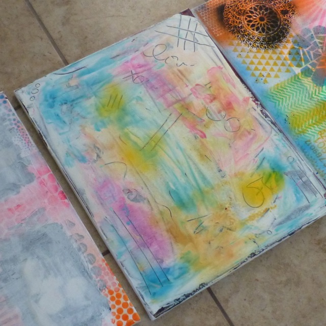
(does your fridge have a giant coil in it? It's so weird!)


These look great in mini sausages, holding finger sandwiches together or skewering veggies in a bloody mary. Put all that washi you're hoarding to good use and make someone's day :-)


Monday, June 24, 2013

Voodoo Man Mixed Media Canvas


During this year's season finale of Grimm we met a zombie raising vow-doo man. I love the iconic, inspiring imagery. 

From Grimm:


Here's the villain from Disney's Princess and the Frog:


And this picture was too amazing to pass up.


So I took a crack at my own Shadow Man.

I started with an old canvas and gessoed over the previous picture. While the gesso was wet I etched words and marks into it. You can see the water-reactive colors coming through and tinting the gesso. Yummy!


Once dry, I spray painted the whole thing. Lately I've really enjoyed painting a background entirely and then blocking out sections with a solid color until the picture emerges.


 A few close ups:

It's the first time I've tried flowers and I'm hooked. You'll be seeing more of these.


Here's how that texture worked out. I love etching into wet gesso. 
It creates so much visual interest.
The playing cards might be my favorite part :-)


My husband took this canvas and hung it in his office as soon as it was dry. What a sweet compliment !


Thanks so much for stopping by. 

Warmly,
~~~Nicole

Thursday, June 20, 2013

Mailable Mixed-Media Cards

One of the most difficult things about making cards is mailability. You have to decide pretty early in the process if you're good with paying that extra dime, using a padded envelope or *gasp* reining in your creative ideas to fit the medium and it's mode of transportation. 

The tension between artistic expression and practicality is never greater for me than when card making. But, since I send most of the cards I make to Canada, I've decided that 
flat is phat and lumpy makes me grumpy

LOL. No. I haven't been drinking. I'm just a giant geek today :-)

Michelle Wooderson makes great cards and her designs are easy to flatten if you leave off the top layer - usually buttons, chip board etc. I've used her ideas as a jumping off point for all of these cards. 

Also, soft embellishments, like a modest amount of seam binding, are wonderfully crushable and can rarely be felt through the envelope. It's my go-to supply when I want to add a little softness to a flat(ish) card.

My go-to supplies for cards like this are washi tape, tags and gesso. They pack a lot of punch without adding thickness.

For these cards I employed one of my favorite little tricks, I stamped on pre-printed journal cards.


 The one on the right had the brown border and I added the stamped flower and sentiment. 


I love how the stamping integrates into the design.

This duo was made using the scraps on my craft table.


 I employed a similar design on both, but they ended up looking fairly different. 
Both cards needed a little more oomph so I colored around the tag with watercolor pencils and then softened it with water. This quick technique totally changed the look and feel of the whole card without adding any (literal) depth.

These are my favorite. Notice anything missing? 


I left the sentiments off so I could add them once I know what is appropriate. The style seems versatile enough to accommodate everything from a birthday to a feel better soon. 

~~~

How important is mailing ease for you? Do you make cards with mailing in mind or leave it up to the universe to sort out? Do you struggle with adding interest to relatively flat cards? What's your favorite technique for creating visual interest without bulk?