Sudha, a long-time friend of this blog, sent me this question,
"I really admire ur mix media art. I myself interested in doing some mix media work on canvas but due to the limited supplies in India I just create the background with acrylic paints, some stencils n masking tape on canvas but could not be able to create the bright effect on background as u create. Could u guide me in this?"
We'll of course I can! Happily! I'm so glad you asked :-)
~~~
This tutorial will be done on index cards but you can use pieces of card stock, manilla tags - whatever paper you have handy. I love index cards because they are inexpensive and pre-cut.
All these techniques work the same on a canvas. I like using paper to practice techniques and color theory.
Start with three or four compatible colors of paint. Mine are a medium pink, yellow, peachy-orange and blue. Try not to choose colors that combine to brown, like red and green.
You'll also need something to scrape the paint on with. I used a hotel room key-card but any plastic card works as does cardboard (like you's get from a box or food packaging). If using cardboard, cut it to a size that comfortably fits in your hand.
To start, drop little puddles of paint on three or four of the cards and, one color at a time, add it to all your cards by spreading it with the scraper. Scrape vertically on some, horizontally on others. Don't worry about overlapping colors - it's where the magic happens. Please click on photos to enlarge so you can see how the paint is applied.
Gather up your stencils and lay them all over the surface of your cards, overlapping as you see fit. If you don't have stencils you can use die cuts, hand-cut snow flakes or things from around your house like lace, produce bag mesh etc.
Spray with color mist. I make my own by mixing water and liquid water color in a spray bottle. For the red, I mix acrylic paint and a lot of water in a spray bottle. You can buy these at the craft store - Mister Huey Misters and Tattered Angels are my favorite. But in my opinion, homemade is even better. For shimmer, add some mica powder to your mix.
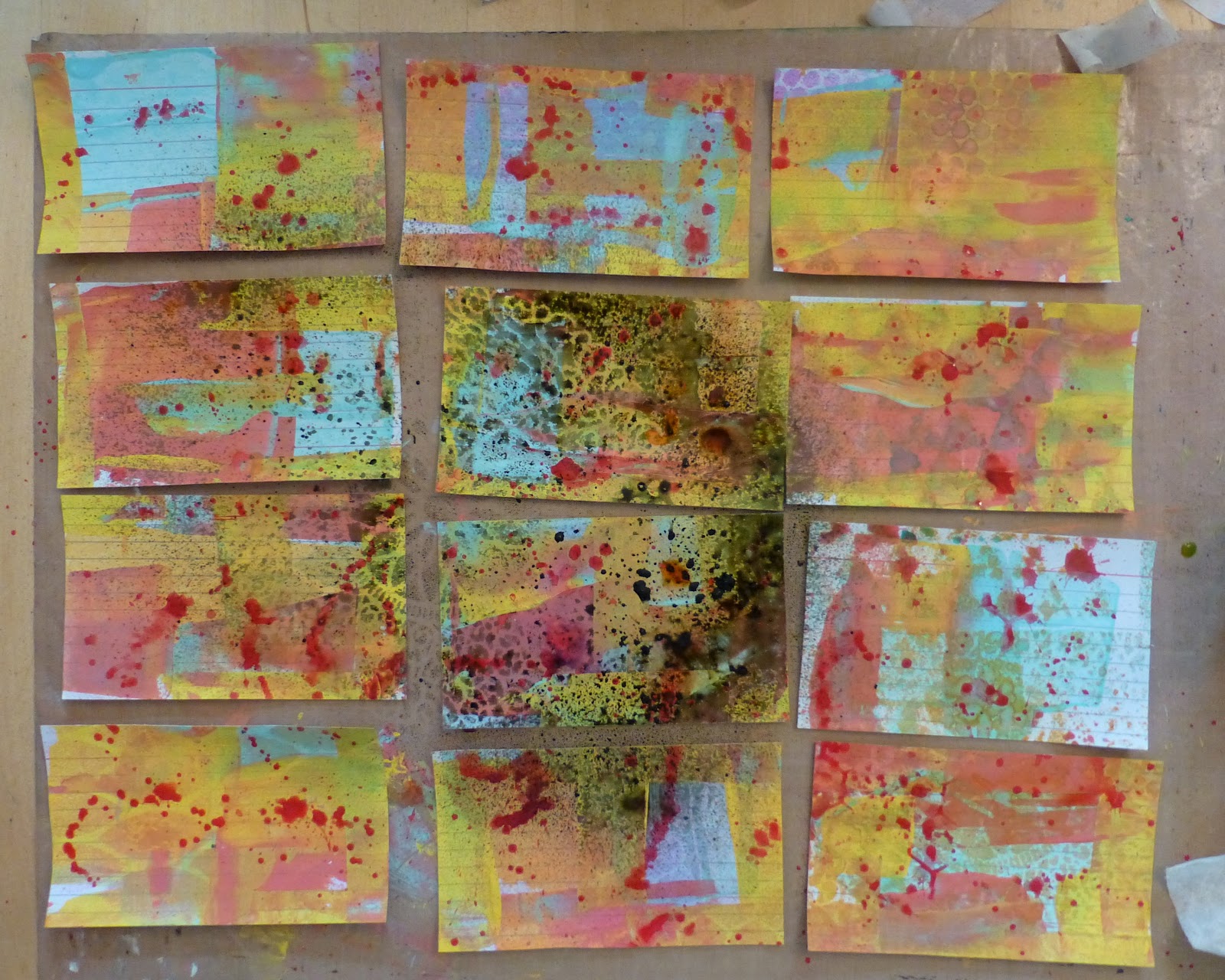
I used teal, yellow, orange and red spray here. I didn't want to stray too far from my initial color scheme just yet.
Carefully lift off your stencils. I blot mine into my art journal to not waste any color.
As you can see, the result isn't that dynamic...yet.
I like to have a few darker, moodier backgrounds on hand so grab another stencil - this one is a plastic doily - and spray with black mist. Try to keep it to four or five cards,
Now I have 2-4 darker cards and a little bit of grungy over-spray on the brighter ones.
Tape down some punchinella (sequin waste) and scrape some white paint through the holes.
Do this just on one side, again only adding the white to four or so cards.
Next, find another stencil, I love these letter ones from office supply stores, and scrape red paint through it.
Empty any additional paint off your scraper onto other cards. Do you see where I added the red? Just a little here and there will make a huge difference.
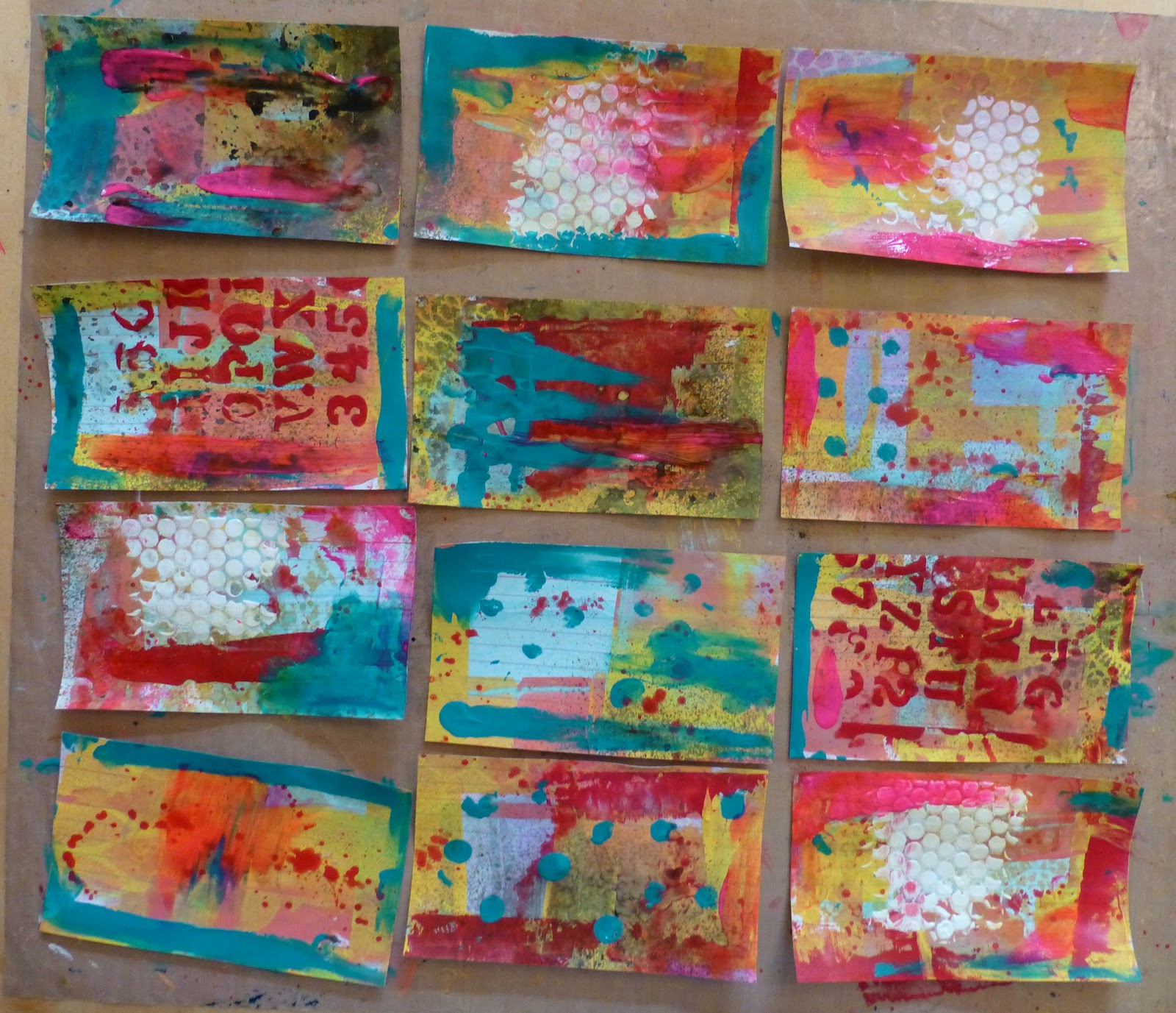
Now for some contrast. Take some turquoise paint and add it to your cards using your fingers. I have a bad habit of adding 'photo corners' and borders with paint... ALL THE TIME! So I tried to spread some in the middle too. Variety makes these cards sing! But if you look at the picture, it's mostly edges.
Note that on some cards (top right) I barely added any.
Do the same thing again with another contrasting color. I used neon pink because it was still close to the original set of colors but it is so much brighter - it should pop.
Are you feeling panicked that it still doesn't look like much? Don't be. The number one rule of mixed media is to have the look of gorgeous layers you need to make layers. There is no shortcut.
Come in with my very favorite product, gesso, and white-out some of the areas on your cards. Knock down color you don't like. Soften some edges. Add some thick and some thin.
The reason we used mists in the second step is because they are water reactive. They will come up through the gesso as it dries and the effect is incredible. See above, the
blazonry stencil in fuchsia is coming up through.
Use the handle of your paintbrush to doodle into the gesso, exposing all the lovely color underneath.
Take black acrylic paint and flick splatters all over your cards.
My 'method' is to shake my paint really well so that some of it comes up in to the cap. Then I get a small brush really wet and dip it into the cap and flick the paint onto my work. If it's too dry I add more water. Once I'm done, I usually shake out the cap onto my project to so as to not introduce the water into my paint bottle. There are a lot of other ways to do this : tooth brush, mixing diluted paint in a cup or on a mat etc. but this works for me.
Gather up some ephemera - I usually use whatever is on the table - receipts, junk mail, notes, lists etc. But on this occasion I used a
paper kit from Gauche Alchemy.
Mod Podge ripped up bits of ephemera onto your cards. Don't over think this. Where you place it is fine. I promise. If you don't have Mod Podge, watered down glue works just as well. If you're being fancy, matte medium or gel medium would be a great choice.
Add some stamping with permanent ink - like Staz-On. I prefer very light stamp patterns, like this script, as it unifies the collages without overpowering them.
Don't be afraid to stamp partial, angled or imperfect images.
It makes your piece more interesting.
The results!
Using 12 identical index cards and less than an hour of your day, you should have a dozen, unique mixed media backgrounds to use in your art.
If you don't like one, it's perfect to cut up into other collages, punch out into shapes or you can cover it up with gesso and start all over again.
And remember, these are backgrounds.
Once you add a focal image, the character of the card will be very different.
Notice (above and below) that I tried to keep the interesting scrapings to the sides so it will still be visible after I add my focal image. If you add something very cool to the middle of your paper, then your card might be better viewed as 'complete' as an abstract. Otherwise you'll just cover up all your beautiful work.
If you have any questions, please ask.
You never know, maybe your question will be my next tutorial.
Warmly, Nicole
P.S. If you want to see more examples of mixed-medai backgrounds made this way please check out these posts:
P.S.S. Want to see what I did with one:






 to make the stamped circles on the right hand side. The heart at the bottom left was carved by my youngest.


 I used for my