Showing posts with label tags. Show all posts

Wednesday, May 15, 2013

Art Journal Page Featuring Stampotique

(click to see this full-sized)

Happy Wednesday everyone!

Hope your week is going well. We're busy unpacking and getting ready for our trip back to Canada next week. It's exciting to see the house coming together.
I'll share pictures as soon as I can find my camera ASAP

This week Kim picked the challenge over at the Stampotique  Designer Challenge Blog and would you believe it's their 100th challenge? Huge congrats to everyone involved. It's one of the few challenge blogs I can't wait for each week and I play along with regularly.

The  SDC Challenge 100  theme is, "Anything Goes" and I LOVE being able to just mess around and see where inspiration takes me.

It took me to my art journal. Surprise. Surprise.

On the left side I used Beauty Verse on a mixed media tag that features spray ink, stenciling, french dictionary text and messy stitching with black thread. 

The base of the page has layers of paint, stencils (fragmented flowers is one), stamping and Neocolor II and I brought it all together with a tiny bit of striped wash tape. 

For the right side, I built the base up with paint, stencils, spray and music paper. 

 I stamped Heart Throb on a Handmade layers tags from Elle's Sudio and colored him with copics. Stamping on pre-made (printed) tags is one of my favorite short cuts. What you lose in control over the paper you more than gain back in the illusion of complexity.

Doesn't it look like the red chevron at his feet is washi tape and the blue dotted 'stamping' to his left is also the printed tag. The "no. 12' too. In reality, all I added to the tag was Heart Throb and the red splatter. 


Isn't Heart Throb just the most loveable stamp? I'm smitten.

To match things up nicely I added the other half of the ripped piece of striped washi tape above the focal image. I think that sort of symmetry brings a lot of balance to an art journal page.

Speaking of balance, did you notice how the two sides are very different but the weight of the images is about the same, the colors are repeated (blue on the left in amongst the orange and red and the yellow on the right)

Also in addition to the striped washi tape,  I had manilla tags on both sides as well as red paint splatters.

Sometimes art journal pages can get a little crazy - and that's awesome - but if you are looking for something a bit more calm to look at, or you want to make sure your quote gets as much attention as your focal image, you can do that with weight and symmetry and you don't have to sacrifice fun painty layers. 

Thanks so much for popping by.
Warmly,
~~~Nicole


Monday, June 25, 2012

Mixed Media Backgrounds Tutorial


Sudha, a long-time friend of this blog, sent me this question, 

"I really admire ur mix media art. I myself interested in doing some mix media work on canvas but due to the limited supplies in India I just create the background with acrylic paints, some stencils n masking tape on canvas but could not be able to create the bright effect on background as u create. Could u guide me in this?"

We'll of course I can! Happily! I'm so glad you asked :-)

                                                                          ~~~

This tutorial will be done on index cards but you can use pieces of card stock, manilla tags - whatever paper you have handy. I love index cards because they are inexpensive and pre-cut.

All these techniques work the same on a canvas. I like using paper to practice techniques and color theory. 

Start with three or four compatible colors of paint. Mine are a medium pink, yellow, peachy-orange and blue. Try not to choose colors that combine to brown, like red and green.

You'll also need something to scrape the paint on with. I used a hotel room key-card but any plastic card works as does cardboard (like you's get from a box or food packaging). If using cardboard, cut it to a size that comfortably fits in your hand.

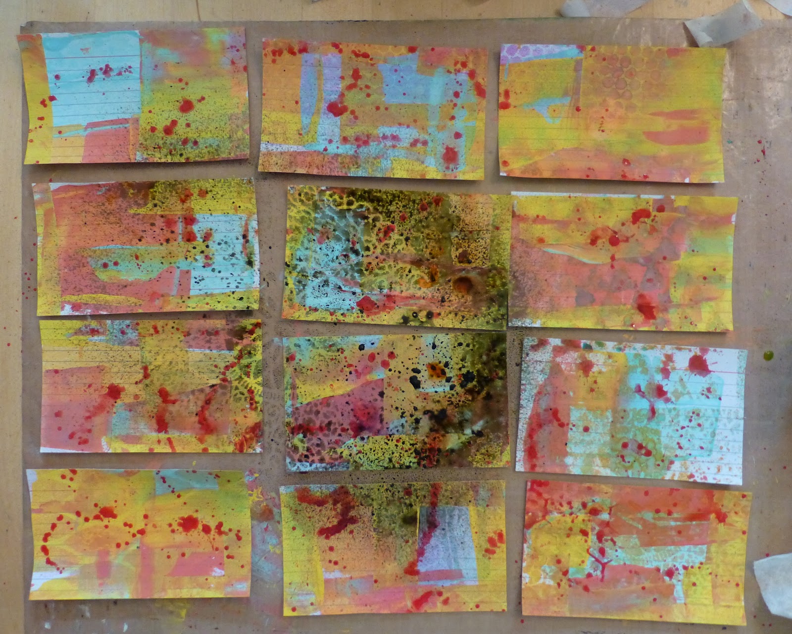
To start, drop little puddles of paint on three or four of the cards and, one color at a time, add it to all your cards by spreading it with the scraper. Scrape vertically on some, horizontally on others. Don't worry about overlapping colors - it's where the magic happens. Please click on photos to enlarge so you can see how the paint is applied.


Gather up your stencils and lay them all over the surface of your cards, overlapping as you see fit. If you don't have stencils you can use die cuts, hand-cut snow flakes or things from around your house like lace, produce bag mesh etc. 


Spray with color mist. I make my own by mixing water and liquid water color in a spray bottle. For the red, I mix acrylic paint and a lot of water in a spray bottle. You can buy these at the craft store - Mister Huey Misters and Tattered Angels are my favorite. But in my opinion, homemade is even better. For shimmer, add some mica powder to your mix.

I used teal, yellow, orange and red spray here. I didn't want to stray too far from my initial color scheme just yet. 


Carefully lift off your stencils. I blot mine into my art journal to not waste any color. 
As you can see, the result isn't that dynamic...yet.


I like to have a few darker, moodier backgrounds on hand so grab another stencil - this one is a plastic doily - and spray with black mist. Try to keep it to four or five cards,


Now I have  2-4 darker cards and a little bit of grungy over-spray on the brighter ones.


Tape down some punchinella (sequin waste) and scrape some white paint through the holes.
Do this just on one side, again only adding the white to four or so cards.


Next, find another stencil, I love these letter ones from office supply stores, and scrape red paint through it. 


Empty any additional paint off your scraper onto other cards. Do you see where I added the red? Just a little here and there will make a huge difference.


Now for some contrast. Take some turquoise paint and add it to your cards using your fingers. I have a bad habit of adding 'photo corners' and borders with paint... ALL THE TIME! So I tried to spread some in the middle too. Variety makes these cards sing! But if you look at the picture, it's mostly edges. 
Note that on some cards (top right) I barely added any. 


Do the same thing again with another contrasting color. I used neon pink because it was still close to the original set of colors but it is so much brighter - it should pop.


Are you feeling panicked that it still doesn't look like much? Don't be. The number one rule of mixed media is to have the look of gorgeous layers you need to make layers. There is no shortcut.


Come in with my very favorite product, gesso, and white-out some of the areas on your cards. Knock down color you don't like. Soften some edges. Add some thick and some thin.


The reason we used mists in the second step is because they are water reactive. They will come up through the gesso as it dries and the effect is incredible. See above, the blazonry stencil in fuchsia is coming up through.


Use the handle of your paintbrush to doodle into the gesso, exposing all the lovely color underneath.


Take black acrylic paint and flick splatters all over your cards.
My 'method' is to shake my paint really well so that some of it comes up in to the cap. Then I get a small brush really wet and dip it into the cap and flick the paint onto my work. If it's too dry I add more water. Once I'm done, I usually shake out the cap onto my project to so as to not introduce the water into my paint bottle. There are a lot of other ways to do this : tooth brush, mixing diluted paint in a cup or on a mat etc. but this works for me.


Gather up some ephemera - I usually use whatever is on the table - receipts, junk mail, notes, lists etc. But on this occasion I used a paper kit from Gauche Alchemy.


Mod Podge ripped up bits of ephemera onto your cards. Don't over think this. Where you place it is fine. I promise. If you don't have Mod Podge, watered down glue works just as well. If you're being fancy, matte medium or gel medium would be a great choice. 


Add some stamping with permanent ink - like Staz-On. I prefer very light stamp patterns, like this script, as it unifies the collages without overpowering them. 


Don't be afraid to stamp partial, angled or imperfect images. 

It makes your piece more interesting.


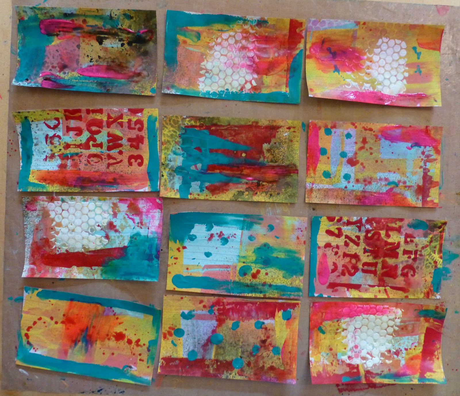
The results!
Using 12 identical index cards and less than an hour of your day, you should have a dozen, unique mixed media backgrounds to use in your art.


If you don't like one, it's perfect to cut up into other collages, punch out into shapes or you can cover it up with gesso and start all over again.

And remember, these are backgrounds. 
Once you add a focal image, the character of the card will be very different.


Notice (above and below) that I tried to keep the interesting scrapings to the sides so it will still be visible after I add my focal image. If you add something very cool to the middle of your paper, then your card might be better  viewed as 'complete' as an abstract. Otherwise you'll just cover up all your beautiful work.


If you have any questions, please ask. 
You never know, maybe your question will be my next tutorial.


Warmly, Nicole

P.S. If you want to see more examples of mixed-medai backgrounds made this way please check out these posts:

P.S.S. Want to see what I did with one:


Friday, June 1, 2012

Today Art Saved Me: Index Card a Day


Not to have a whiny baby post but my back went NUTSO this morning and by the time my DH left for work I couldn't walk, lift my arms, was in TERRIBLE, FREAKISH PAIN(!!!) had taken my maximum meds and was still sobbing. 

Kind of a lame-o start to the month of June.

My boys came home from an early morning landscaping job and I pulled myself together for their sake - as us moms are wont to do. They immediately wanted to know what was up with the index cards on the table.
 I explained to them that we were doing Index Card a Day for June and July - 61 cards in total and went over the rules (basically put something on an index card).


They said I better creep over to the table and join them then. And so I did. Slowly, painfully, with a few bad words. I made it to the table and we got painty. Well, my youngest and I did. My oldest is insistent that this is a great opportunity to illustrate Java and OO principles so they can really get straight in his head

 and my middle guy loved the grid prompt so he did a markers and pencil card.


Here's my youngest's:


Look at all the texture!

This one's mine:

And all together:

Here's my boys working on their cards:


And we're storing the completed cards in a berry basket. Cute and handy.


Have a great weekend!


Tuesday, May 8, 2012

Scrape that paint: Tags!


Just a quick pop-in to say hello!


I always scrape leftover paint, empty my brushes or flip over stencils onto manilla tags or into gessoed but  unused journal pages. While it doesn't look like it will ever amount to anything; in fact it goes a long way to creating the layers of color and texture - totally serendipitously - that we all love. 


And the cost to you is near nil.

When I stamp, I usually stamp an entire sheet of images and color them as needed, or all at once if it suits my mood. When the need for a gift tag arose, I grabbed a 'decorated' tag, a pre-colored stamped image and all I needed to add was some appropriate text.

My Stories from Shakespeare for Children book is perfect for interesting sentiments.


While the glue was drying I tied some hand-dyed seam binding through the top and it was ready to attach to a parcel.

For me, having painted tags, colored stamped images and seam binding on hand means I can get a gift or card together in no time at all.

Stamp Used: Stampotique's Uncle Buck (ROFLMBO)

Tuesday, May 1, 2012

Coach (or Teacher) Gifts and Easy Recycled Tags


We wanted to do something nice for the boy's swim coaches and this was a huge hit. All the parents kept asking if it was someone's birthday and the coaches were thrilled! Yay!

 While it's a little bit expensive, we were giving one gift from two kids and really wanted them to know how much we appreciated their role in Avery and Brayden's life.


First we chose towels in colors that we thought suited them


as well as magazines based on their interests.

 
We also added some Twizzlers and sunscreen, both things will come in handy when lessons switch to the outdoor pools or when they're just hanging out enjoying the summer sun.

It was really fun personalizing each gift and taking a moment to think about each coach.

For ribbon I chose polka dots for girls and plain black for boys. Keeping it simple is always the better choice.

What we didn't have time for though was fancy crafting for the tags. So I went to my go-to technique of recycling packaging. If you don't have any packaging on hand, old calendar pages or scrapbook paper work just as well.


When I opened my Dina Wakely Stamps I remember thinking, " she did all the work for me" when I saw the awesome collaged insert. I kept them for later use. 

First you need to trim the packaging down to the part you want to keep. In this case, I let the focal image determine the size of the tag.


Ink the edges and attach to manilla tags.
Add the recipients name with a label maker.
Easy!


These seemed a little too simple but since we were running out the door, I wanted to add something but it had to be dry: no paint, no glue, no glitter... and unisex. What to do?

Free-motion stitching. I added a few looks in black thread and chain pieced them so I didn't even have to start and stop sewing. See - they're all connected.


Trim the threads and attach to your gifts.


Thanks to Rachel Berry for the idea - via Pinterest.