Showing posts with label stencil. Show all posts

Tuesday, January 13, 2015

Hand Carved Cake Stamp and Card Set


This year I'm going to try to be a bit better about birthday cards. I'm absolute rubbish. And Facebook made it easier to remember but I left Facebook last year so I'm right back to not.

Carving a cute new stamp seemed as good a place to start as any, no?

And this card set ensures at least four people will get cards this year. Which, sadly, will be a huge improvement.


All the cards were made the same way:

1. Stamp image on white card stock using black Staz-On ink
2. Stamp image on post it note. Cut out and use as a mask to protect the nice clean cake image.
3. Dab Ranger Distress Ink through 'stencil' with a foam cosmetic sponge - in this case the stencil was some old fancy cut out paper... KI Memories I think. Laser cut cardstock was quite a thing a few years back. Note: On the top card, I stamped a Hero Arts French Script stamp with distress ink, let it dry and then stenciled over top.
4. Add a sentiment - these are Papertrey stamps on bits of Gelli Prints.


This one was a little different, same idea but with a number laser cut, no ombre effect and I stamped the sentiment right onto the card like a ribbon.


Tuesday, May 27, 2014

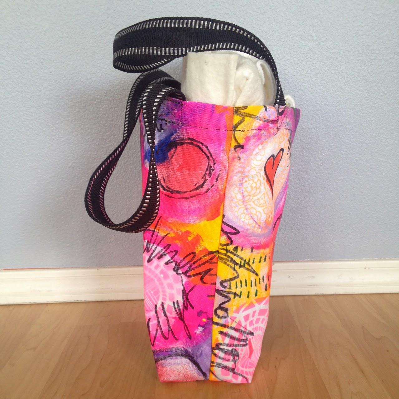
Neon Pink Painted Canvas Tote

So... our new house is under construction due to some very unexpected major issues. 

It has made unpacking tricky to say the least. 

But, as I was opening boxes and seeing what's what I found a huge bin of fabric paint and some white duck cloth. 

SCORE!!!

Within a few hours that white fabric had an extreme makeover. 


Since I need a tote as we've been doing all our errands by foot, I got to it.

What do you think?


As it is my first bag, I'm pretty happy with it. And we ran errands with it and it was super-comfy and held loads of heavy things without a hitch. Yay!


Saturday, January 25, 2014

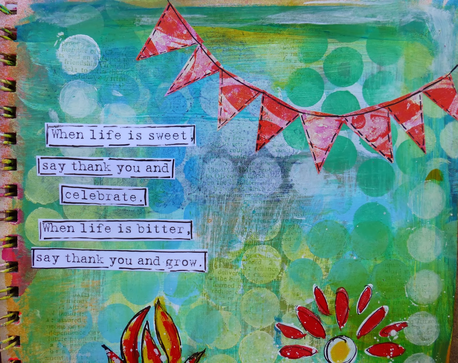
Say Thank You and Grow: Art Journal Page

Click to see this full-sized


This is one of my favorite quotes. I think remembering to be thankful regardless the circumstances is the key to a happy life.

This page happened very organically. I had a miss-mash of orange and pink as the base and I wasn't loving it. So while I was on the phone one day I added a thin layer of green here and there and decided to unify it with stenciling through large holed punchinella.


I ended up being on the phone a long time so I stenciled and stenciled and stenciled, changing the color on my make up sponge slowly from white to blue. There is a ridiculous amount of painted layers on this page but in the end, only the top few show all that much and even though there was a lot going on, it avoids being busy because all the motifs (circles in this case) are the same.


For the banner, I used some gelli prints that tie the flowers in to the page. 

My big fear I was trying to face on this page was using red and green in a non-Christmas setting. I always worry that whatever I make with these two colors will look themed regardless of the images. 

What do you think? Is it Christmasy at all? Did I meet my objective in using red and green in a more generic way? The color scheme is so bold and powerful, I'd love to be able to experiment with it beyond Thanksgiving to New Year.

Art Journal Week Posts:


Wednesday, January 22, 2014

Royal: Art Journal Page

Hello everyone. I hope you're enjoying art journal week. Welcome to Day Three!

This is an interesting page in that I took a 'problem' and made it into something better than I think I could have thought up on my own.

As an unrepentant stencil-blotter, I often slam down the dripping plastic into my art journal with zero thought to how it's going to impact future crafting. Which can be marvelous, really, but towards the end of an art journal some of the pages can be a riot of orange/blue, green/red, purple/yellow. All lovely combinations in their own right but terribly muddy if you let them mingle.

And since my spray inks are water reactive they will blend if given the slightest chance. 

I decided to go with it, instead of fight it and hope that the brown would turn out to be a warm, graceful skin tone. And sure enough, it was. I had to take care in adding the water to my page with a wet brush. I saturated some areas; blending the stencil marks almost entirely away (left side and nose). And in other spots, like the right side of the face and the neck, I used an extremely light touch, bonding the different tones together but not losing the distinct colors and patterns.

I made the face using a Stabillo pencil and a stencil from Jane Davenport and I blocked out the background with a mix of Golden Payne's Gray fluid acrylic and Blick's Titanium White heavy body acrylic. For the crown, I let the stencil blot drive the design; the irregular shape is very pleasing to me. 

Usually I add a quote or some journaling but this image felt strong enough to express what I needed to express that day. And when you're happy with something, knowing when to stop can save you a lot of time and trouble.

Art Journal Week Posts:
Day Three: Royal (you are here)

Tuesday, January 21, 2014

Merely to be Normal: Art Journal Week Day Two


Welcome back to Art Journal Week. I was looking at all my post and I already have ten so… art journal fortnight? 


This is so me. Anyone else relate?


One of the easiest tricks for helping your art journal pages not get away from you into chaos is to pick a color and then two colors that are very close to the 1st one. For example here I used, teal, teal with white mixed in and a little blue (ultramarine or manganese, I'm not sure). It gives you a monochromatic background that you can add as many layers as you want to without making it hard to look at. 

*Black and white don't count so I use loads of both.


After that, add in one contrasting color for pop.

While I've been known to empty the whole fridge onto a page, this formula saves oodles of time.

But I see more than one contrasting color, what gives?

Since I never start with white pages (stencil blotting, brayer cleaning and what not) there is always a little something showing through. Generally speaking, that something is enough to add interest without driving the design principles for the page. Had I left more of the mauve and orange on the left showing I would have had to approach this page differently.


Thanks for the visit. 

Art Journal Week Posts:

Monday, January 20, 2014

Art Journal Live: Branch Page

I recently instituted a 'no computer until paint hits paper' rule and now I'm just over run with art journal pages that I haven't shared. So… without further preamble…

Welcome to art journal week! 

All week I'll be posting art journal pages and hopefully you'll see some ideas that inspire you get out your journals and play too.

 click image to see this full-sized


I downloaded the Art Journal Live videos from Interweave and promptly went to work following along with Dina Wakely's class. It was so awesome. 


The topic was when you hit the "now what" spot on an art journal page. The whole video was peppered with wise tips and tricks that were easily put to immediate use.


My page turned out a lot darker, in part because I didn't have any white space to begin with. I always blot off my stencils and run my brayer clean on my journal pages so it's rare I ever have plain white to begin with. But since I love color so passionately, it's never a problem.


Thanks so much for the visit, come back tomorrow to see more art journalling.

Art Journal Week Posts:
Day One: Branch (you are here)

Thursday, January 16, 2014

Art Journaled Planner Page


The first prompt for The Documented Life was your front door. 

Most people photographed or drew front doors (real or imagined) but I really wasn't feeling it so I journaled about my front door


I hope the page evokes a feeling of growth, change and awakening.


Other planner posts can be found HERE.

Tuesday, November 26, 2013

Marie: Painting in Stages


This is a painting that I've been working on as I'm trying to transition my style from somewhat realistic to more figurative and expressive. I'm terribly excited about getting her to look how I imagined in my head.

I'm not going to write much more as I hope the feeling, expression and the time in Marie Antoinette's life comes through from the art as opposed to just me jabbering about it :-)


I took pictures of each stage and am quite surprised how sharp a turn it took between picture three and picture four. As you can see, my starting point was the dimensional paste hair. Don't you just love that stuff? It adds so much to a piece!


Thanks so much for visiting :-)


P.S. There is a sale in my Etsy shop through Thursday. Use the code TURKEY20:


Tuesday, November 19, 2013

Mysterious Art Journal Page

The Monday Challenge this week at Simon Says Stamp blog is, It's a Mystery:
From Nancy Drew books to techniques that are hard to figure out just from looking at a finished project, DT member Andrea and her father inspire us this week with the challenge of “mystery”. Will you embrace your inner Sherlock Holmes? Mystify us with your technique prowess? Or perhaps your project ties into this week’s theme by simply mysteriously being unclear on how exactly it fits! However you choose to interpret the theme, we can’t wait to see your creations!


I decided to embrace the theme on several levels, the first is that I've been reading a lot about the unconscious mind, the subconscious mind and the mind-body connection.

Few things in my opinion are more a mystery than how our unconscious minds work.

And since in dreams and symbols the person's psyche is usually represented by a house, I thought this page was a good representation of this mystery I've been so curious about.


Apparently my psyche is a techno-color, neon, jubilant, riot, party.


From a techniques perspective I tried a new supply - Liquitex acrylic ink. It was a total mystery to me regarding how it was going to act and react and OMG, I'm in love. It spreads and mixes like a champ, has rich, deeply saturated hues and then dries permanent. That's bliss in a bottle, folks.

I added the hymn paper with Mod Podge and not a speck of color came up. Awesome!

This is also linked up with Julie Balzer's Art Journal Everyday post.

Tuesday, September 17, 2013

End of Patience: Art Journal Page

This is the other side of the 'one idea, two ways' project I was working on.


I really love how the Stabilo pencils bleed gray into the white paint. It adds interest and shading without  extra effort. 


Monday, September 16, 2013

Never Apologize For Who You Are: Art Journal


This is a page I did for Dina Wakely's lesson for LifeBook. 


It was a dresses assignment and I did one in a dress (I'll post it tomorrow) but then made another wearing pants. 


Seemed like a good message for a Monday morning.