

For 2014 I was interested in consolidating my embarrassingly numerous art journals, planners, notebooks, diaries and whatnot into one place. It's not that my family doesn't just love having my book-crap on every available surface but it was getting ridiculous. And we've been in a down-sizing frame of mind lately so this seemed to be another step towards that goal.
This used to be a plain black, skinny, wimpy looking Moleskine Daily Planner.
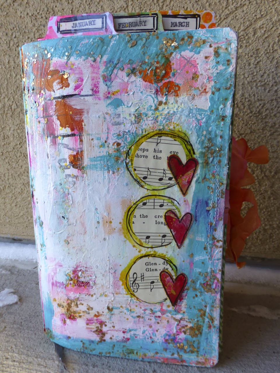
Can I just say how flat and pathetic that thing looks. I had serious doubts I'd be able to fluff it up and make it a big colorful fatty. But, as the spoiler-y pic above proves. It happened.
To make the cover I committed many crimes against my art supplies. Most are probably not repeatable. Sorry.
For starters, gesso. Everything starts with gesso and I spread that stuff on thick and unevenly. IMHO, evenness is yucky when you're art journaling.

Then I added paint, stamping and stenciling with Dylusions spray, some pen work (just a little as it's really not my thing) and to be honest it looked nasty. Like someone had taken a class and they followed step one to step two to step three without even a hint of inspiration or personality.
I wish I'd taken an 'in progress' shot or three so you could see it. So terrible.

Deciding the whole thing was a lost cause anyway; I employed a favorite technique of mine.
I pulled out my trusty heat gun and cooked all that acrylic paint until it bubbled and lifted off the gesso in big irregular sections. Then I scraped the loose mess with a credit card revealing all sorts of gorgeous layers. Now we're getting somewhere.

Next I rubbed teal paint around the perimeter of the book and scraped it down the page with a credit card. This was necessary as I'd dripped some red ink that ended up looking like a poorly managed massacre. It was hideous. The teal covered it up exquisitely.

And because I love some hard-wearing sparkle I scraped on some Large Gold Mica Flake Gel (golden) with a palette knife. Then I let the whole thing recover quietly, undisturbed, overnight so all those layers could cure and settle.
The next morning all it needed was a little book paper, some punched mixed media hearts and some doodling.
Confession: The first book paper circles were green, hideous. So I added yellow over top to punch them up and it looked even worse. But the hearts were on… what to do.
So I carefully peeled up the heart and Mod Podged plain hymnal paper overtop the green/yellow ones and stuck it all back down. It made a lovely yellow border that I'm totally thrilled with.

I think 90% of art-journaling is being fearless and the other 10% is knowing when to stop and when to keep pushing forward.
Here's the back cover:

It's great how the stamping and journaling shows through after I scraped off a few layers.

So there you have it :-)
Thanks so much for popping by.

7 comments:
Wow, wow… this is wonderful. The word hideous is not applicable here !!! Love it.
Corrie x
Gorgeous! My cover is colourful but not textured yet. I am going to do more to it at the end of the year.
Fabulous Nicole! I love what you've done!
LOOOOVE it!!!
beautiful bright grundginess! ;)
Haven't started my cover yet, yours is very cool full of texture & loads of layers, stunning! :-) x
Hi! It looks great! I've just done something similar... Kept adding then realising it was nasty so scraped the lot off and it was fab so I worked with that.. Maybe that's our new technique :) I might try it more often now I know you can create something as wonderful as you just did! Ingrid x
Post a Comment